Combining water color painting with love of watches and bracelets

My love for bracelets and watches has led to a new photo hobby, that of wrist-shots, which is obsessive, no doubt about it.  Combining this with a love of water color painting is particularly fun.

George Washington and BlackBelt braceletMy bracelets have been getting enough compliments in the last year that I’ve opened a store at http://www.vinchesidesigns.com, come visit if you are interested.

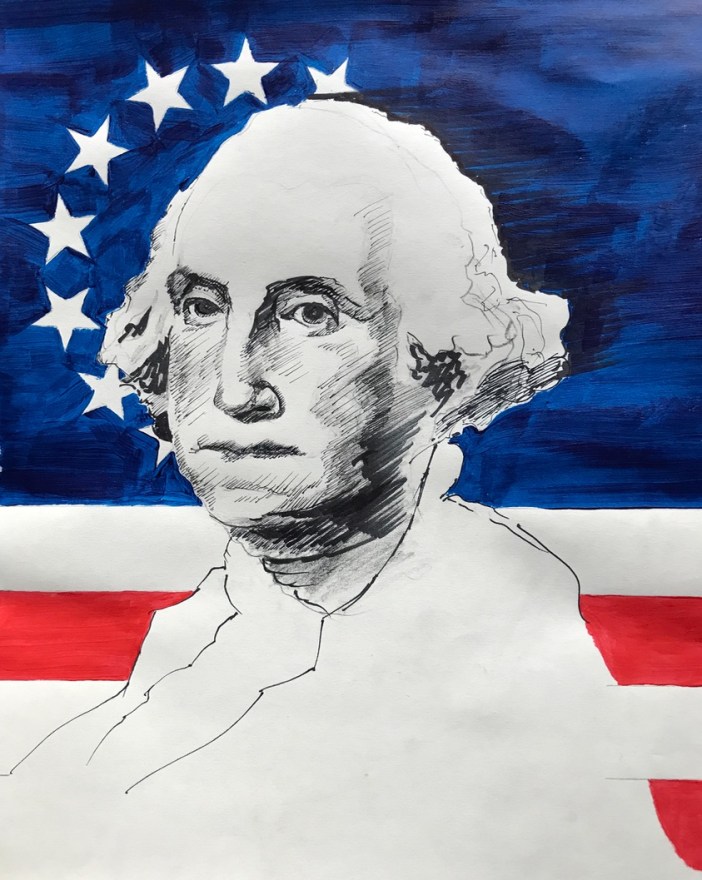
GW in acrylic

GW.acrylic.vinchesi

Like many of my paintings, this one started out as a practice-drawing that I kept messing with. I used a sketch pad (not the right paper at all) but things start to take shape and what can one do but follow where it leads…

I find the artistic process to be very challenging (will it be any good? it started off terrible, is it worth continuing or should I start over? when is it done? and 100 other questions) and this blog is largely designed to share the process and commiserate with people who suffer through the same experimentation.

When I see other artwork that I like, I always wonder what it looked like at the beginning, and the middle, and the end.

Here is a bit of the evolution on this image:

GW evolution.vinchesi.acrylic.2018

My intention is to continue the stars on the top right, in such a way that they are in front of George’s face (not all the way around, but maybe four or so). I like the idea of placing GW a bit in the background (subtle or more dramatically, such as in my paintings in which he is at the bottom of the frame, with a lot of space above his head) as he himself labored to do in the face of countless opportunities to seize the One Ring, which he never did.

GW love — 1st painting with color

I want to share my progress on a watercolor of George Washington, it’s about 80% of the way there and this is what it looks like right now:

GW.1.2018.2

I need to add the flag above his head, and fix some issues with his dome.

But the big breakthrough for now is that I discovered the round brush and was able to move the paint around in such a way that it got more interesting.

At first when adding the blue background I used a one-inch flat brush, and on this paper (it’s the “wrong” kind, not 100% cotton and therefore not great for blending color) it produced a horrible-looking patchwork of strokes that were unintentional.

Even worse, if I went over the area too many times, previous layers of blue started to come off, back into the brush, and then got bunched up toward the end of the stroke. This created very light values in the midst of what was supposed to be dark values — very frustrating.

The round brush was a revelation and I finally feel as though I am painting with water color and not acrylic or oil.

As I painted around the rectangle that will become the flag, I realized that I needed to lighten the background against what will be the flag’s deep blue in its upper left corner. The blurring did just the trick, lightening the area in a gradual way and will allow me to come in hard with color on the next pass.

Star blurs

Also you can see on the left above that I had masked a larger 5-point star behind the flag but realized that it would be too distracting in the composition, and so I blurred those edges as well.  I absolutely love the effect, particular as seen in the top spike, and intend to use this technique quite a bit in future paintings.

It reminds me of a painter / illustrator whom I greatly admired in the 1980s, Brad Holland. His backgrounds in particular are complex and haunting in a good way. Here is one of his works:

Mike Tyson by Brad Holland

I realize that his paintings are probably done in oil and not watercolor, but that’s ok. I also realize that my painting skills are merely beginner-level, but a man can dream.

Getting back to the flag, I had done some practice nonsense on another sheet of paper and liked what I saw, once again by accident.

Study for GW 1.2018.quick flag

This quick little flag is what led me to want to put it above GW’s head, instead of the star that I had already masked.

Water Color Journey

I’ve embarked in earnest on a water color painting journey, something I’ve threatened to do for years but until now couldn’t quite get started on.

A major inspiration has been the artist Stan Miller. I’ve watched his 20+ videos on YouTube and I’m now “off the couch” and at the table. Here is an amazing demonstration of his skills and teaching, and if you are an amateur artist (or not) you will marvel at what he does here.

My grandfather was an extraordinary artist and I owe any talent I have to him, I believe.  But talent by itself is not sufficient — one must develop it, build fundamentals, and then refine x 1,000,000 repetitions. There is no shortcut.

And so I’ve been following Stan’s exercises, such as learning how to go from light to dark and vice versa, and how to use the water and the paint to build gradations of complexion. Here is my practice:

practice-1

The face is a simple lesson the power of getting the “value” right — Stan loves that word, “value” — meaning its level of darkness against neighboring paint. But of course he is right, as the face takes shape even without detail, which is his point. A detailed painting with values that are off (e.g., not enough contrast) will look lousy.

Although I humbled myself and did these exercises as a first order of getting started, I could not resist applying some of the techniques to a subject that I happen to be obsessed with: George Washington, our nation’s first president.

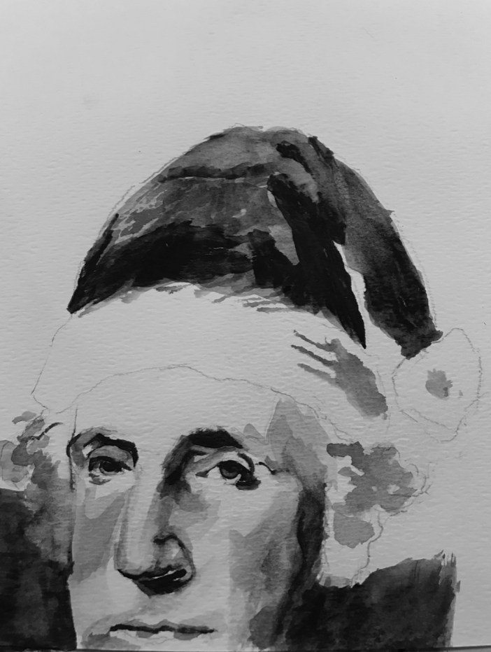
And so I thought I would try to apply the lessons on “value” and using only one color to a portrait of GW, in this case wearing a Christmas hat.

gw-with-christmas-hat-1

The face drops off the bottom of the page because this was not supposed to be a serious attempt. In any event, I am on my way and look forward to continuing the journey.