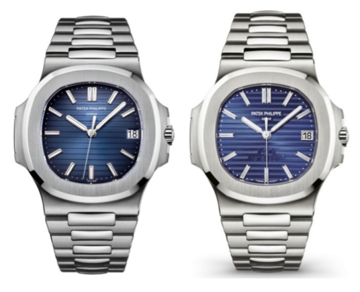
Patek Philippe recently released a 40th-annivesary limited edition of its legendary Nautilus reference.

In the press release, the following mention is made regarding the anniversary lettering that in my opinion features somewhat prominently on the dials:
Both models feature a blue dial with diamond hour markers, the typical Nautilus embossed decor, and a discreet recessed anniversary logo. <link>
One man’s “discreet” is another man’s outrage…on various watch message boards the engraved lettering has been a terrible disappointment to some Nautilus lovers who feel that the additional inscription looks tacky and also clutters a legendarily sparse, yet rich, dial.

I tend to agree: the styling reminds me of certain automobile motifs, and not the ones called Bentley and Rolls Royce.

